Reveal is available on the Premium Tier. For more information, reach out to your account manager or support@tive.com
This article focuses on the following:
Why Use Carrier Insights?
Carrier Insights helps you evaluate your carriers objectively, compare performance across metrics, and drive improvement discussions with real data.
Here’s why it matters:
- Choose the right carrier to protect your business: Once your shipment is on the road, it’s up to the carrier to ensure it is delivered on-time and in full. The wrong carrier can lead to costly claims and degraded customer relationships.
- Stay ahead of service failures and claims: Monitor changes in performance over time to address risks proactively instead of reacting to problems after they’ve happened.
- Make reviews more productive with data you can trust: Use shipment and performance metrics to turn carrier conversations into action plans.
How It Works
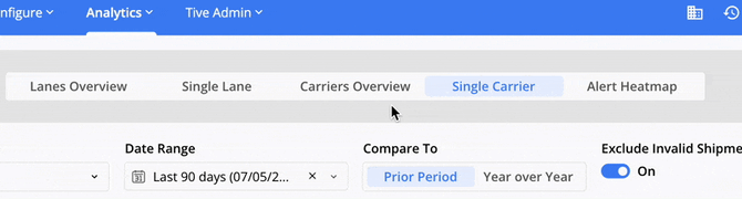
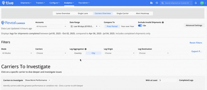
Carrier Insights is divided into two key views: Carriers Overview and Single Carrier.
1. Carriers Overview
Carriers Overview helps you compare performance across carriers, spot trends and risks, and find which partners need your attention to improve supply chain results. Metrics reflect only in-transit activity, and alerts or temperature deviations outside transit are excluded.
Note: The Carriers Overview analyzes shipments at the leg level. This is because the carrier often varies by leg. Single-leg shipments match one set of metrics, while multi-leg shipments count each leg separately, so the number of legs may be higher than the number of shipments.
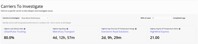
Key Metric Cards:
Quickly identify the best or worst performers for each metric. If you’d like to drill deeper, click a carrier name to open Carrier Details filtered to that carrier and mode.
Tip: To ensure fair comparisons, set a minimum number of completed legs so results only include carriers with enough shipment volume.
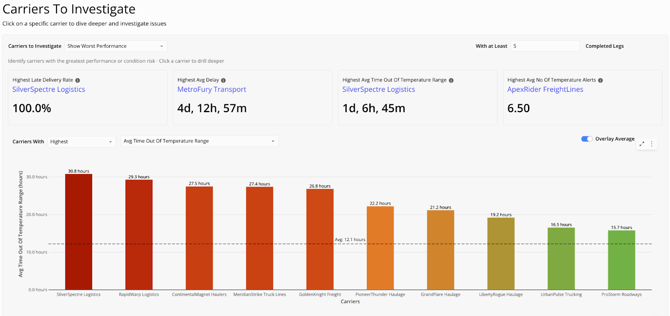
Top 10 Carriers by Metric:
This bar chart ranks the top or bottom 10 carriers for the metric you select. Use the dropdown to switch between Late Delivery Rate, Average Delay, Average Temperature, Average Time Out of Temperature Range, and Average Number of Temperature Alerts. Toggle Highest/Lowest to change the ranking.
A dashed line shows your organization’s average across all carriers, so you can compare each carrier to the baseline.
Note: The chart applies the minimum number of completed legs you set in your KPI cards.
Carrier Trends by Metric
This line chart highlights your top 5 carriers by shipment volume, helping you understand the performance of carriers that can have the biggest impact on your supply chain performance. Use this chart to see whether interventions are improving results or if problems are persisting.
Switch between metrics (like temperature, delay, or on-time delivery) to compare how each carrier is trending. You can also view 12 months of history, with an optional all-carrier average line for added context.

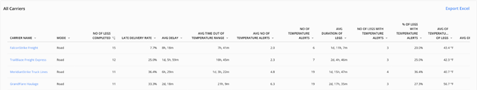
All Carriers:
At the bottom of the page, you will find a data table with key carrier performance metrics for every carrier in Reveal. Use this table to export data for deeper analysis in your own reports or tools. You can also click any carrier name to open the Single Carrier view for a closer look.
2. Single Carrier
When you click a carrier name from Carriers Overview or open Single Carrier, you’ll see a performance dashboard dedicated to that carrier. The Single Carrier page provides multiple views to help dig deeper into a carrier’s performance and pinpoint areas for improvement.
Recommended Filters:
Filters ensure your results reflect the lanes, carriers, and timeframes most relevant to your analysis. Apply your global filters first (including any advanced settings), then use the page-specific filters to refine your view:
- Mode: Focus on specific transportation modes.
- Leg Aggregation: Group by City for precise analysis or by Country for a high-level view.
- Leg Origin & Destination: Select the start and end points that matter most.
Key Metric Cards:
Quickly see how the selected carrier ranks against others in your network for each metric. Rankings are based on the number of carriers that have available data. For example, if 49 out of 51 carriers have shipment arrival times, the Late Delivery Rate ranking is calculated from those 49.
Use these key metric cards to understand if the carrier is a top or bottom performer at a glance.

Key Shipments:
See the top 5 shipments with the highest or lowest values for your chosen metric, so you can quickly pinpoint specific shipments that may be influencing metrics.
Available metrics include delay, time out of temperature range, alerts, average temperature, and more. Switch between Highest and Lowest to change your view. You can click on any Shipment ID to navigate directly from Reveal to that shipment’s page in the core platform.

All Shipments:
Switch to the All Shipments tab to view detailed performance for every shipment, not just the top or bottom performers. Expand a lane to see specific shipments and individual legs. Export this data for deeper analysis in your own reports or tools.

Trend Analysis:
Track a carrier’s performance over time for the selected metric and compare it to your organization’s average (which can be toggled on or off as desired). Use this view to confirm whether corrective actions are improving outcomes or if issues continue.

Temperature Alert Heatmap:
Uncover geographic hotspots where in-transit temperature alerts cluster, so you can quickly find high-risk regions and take action to protect shipments.

Top 10 Lanes by Metric:
Evaluate the carrier’s performance across the lanes they service. See which specific lanes the carrier has the highest risk by metric (such as Delay, Average Temperature, Time Out of Temperature Range, or Temperature Alerts), so you know if problems are limited to certain areas or widespread.
The grey bar shows how your carrier compares to all other carriers on the same lane, helping you distinguish whether issues may be caused by challenges on the lane or by the carrier.

Key Points to Know
- Data Included in Metrics: Metrics include all legs from completed shipments (multi-leg shipments count each leg individually). Only in-transit periods are measured, so waypoint alerts and temperature deviations are excluded.
- Filtering Options: Combine global dashboard filters (including advanced settings) with page-specific filters, Mode, Carrier, Leg Aggregation, Leg Origin, and Leg Destination, for more precise analysis.
Best Practice
- Start Broad, Then Drill Down: Begin in Carriers Overview to flag carriers with rising risk, then dive into the Single Carrier view to uncover the root causes.
- Set Minimum Leg Thresholds: Avoid skewed results by filtering out carriers with too few shipments.
- Use Recommended Filters: Apply filters to focus on the lanes, timeframes, and metrics that matter most (like temperature compliance, on-time delivery rate, or alerts per shipment).
- Standardize Carrier Names: Make sure your carrier names are consistent to prevent performance data from being split across duplicate carrier names. Navigate to Configure > Carriers to merge any duplicates.
Need Help?
If you have additional questions, reach out to support@tive.com for assistance.
Appendix A: Detailed Metric Calculations
This appendix explains how Reveal calculates key performance metrics, so you know exactly what goes into the numbers you see.
Time Out of Temperature Range
Measures the total time a shipment was outside its safe temperature range during each phase of the journey.
- For the first deviation, the shipment was out of range for 30 minutes (3:00 to 3:30)
- For the second deviation, the shipment was out of range for 38 minutes (3:52 to 4:30)
|
Time |
Temp |
Alert Threshold |
Time out of Temp |
|
3:00 |
27.6 |
27 |
30 |
|
3:15 |
27.3 |
27 |
|
|
3:30 |
26.9 |
27 |
- |
|
3:45 |
26.5 |
27 |
|
|
3:52 |
27.2 |
27 |
38 |
|
4:00 |
27.3 |
27 |
|
|
4:15 |
27.4 |
27 |
|
|
4:30 |
26.5 |
27 |
|
|
Time out of Temp Range |
68 |
||
On-Time Performance
Includes both the Late Delivery Rate and the Average Delay. Shipments without a scheduled arrival time are excluded from these calculations.
- Late Delivery Rate: The percentage of shipments that arrive late. For example, if 2 of 4 shipments arrive late, the rate is 50%.
- Average Delay: Average delay time for late shipments. For example, if 2 shipments are late by 30 and 120 minutes, the average delay is 75 minutes ((30+120)/2).
|
Scheduled Arrival |
Actual Arrival |
Late? |
Minutes Late |
|
|
Shipment 1 |
n/a |
4:00 PM |
n/a |
n/a |
|
Shipment 2 |
3:00 PM |
2:00 PM |
No |
n/a |
|
Shipment 3 |
3:00 PM |
3:00 PM |
No |
n/a |
|
Shipment 4 |
3:00 PM |
3:30 PM |
Yes |
30 |
|
Shipment 5 |
3:00 PM |
5:00 PM |
Yes |
120 |
|
Late Delivery Rate % |
50.00% |
|||
|
Average Delay (minutes) |
75 |
|||
Alert Counts per Shipment Stage
Reveal calculates alert averages only for shipments that had the relevant alert type configured (for example, a temperature alert). The denominator for the average is the number of shipments with that alert preset, not the total number of shipments.
For example:
- Temperature alerts are averaged across shipments that had a temperature preset.
- If a shipment didn’t have a temperature preset attached, it’s excluded from the calculation.
The table below shows how averages are derived from temperature alerts, time out of temperature, and total alerts:
|
Temp Alert Preset? |
# of Temp Alerts |
Time out of Temp |
Any Alert preset |
Total Alerts |
|
|
Shipment 1 |
Y |
0 |
30 |
Y |
0 |
|
Shipment 2 |
Y |
1 |
20 |
Y |
1 |
|
Shipment 3 |
Y |
2 |
120 |
Y |
2 |
|
Shipment 4 |
Y |
0 |
0 |
Y |
5 |
|
Shipment 5 |
N |
Y |
0 |
||
|
Shipment 6 |
N |
N |
|||
|
Total (6 shipments) |
4 |
3 |
170 |
5 |
8 |
|
Average |
0.75 |
42.5 |
1.6 |
||
|
Calculation |
3 alerts / 4 shipments |
170 minutes / 4 shipments |
8 alerts / 5 shipments |