Reveal is available as an add-on product. For more information, reach out to your account manager or support@tive.com
This article focuses on the following:
Why Use Lane Insights?
Lane Insights gives you a big-picture view of performance across all of your lanes, so you can quickly spot problems and prioritize where to act. By comparing performance within your network and against the Tive Network, you can uncover improvements where they matter most.
Here’s why it matters:
- Catch risks before they cost you: Find lanes with late deliveries, long transit times, or temperature deviations early, so you can prevent disruptions instead of reacting to them.
- Get context beyond your own data: Benchmark your lanes against the Tive Network to understand whether issues are unique to you or industry-wide.
- Fix the real cause, not the symptom: Drill into lane-level details to see whether issues stem from routes, carriers, or specific shipments, so you can address the real driver.
How It Works
Lane Insights is organized into two main views: Lanes Overview and Single Lane.

1. Lanes Overview
Use the Lanes Overview tab to quickly see how your lanes are performing. This view highlights trends, performance gaps, and problem lanes so you know where to focus improvements. Lanes are compared side by side on key metrics, including:
- Change in average transit time
- On-time delivery rate
- Time out of temperature range
- Alerts per shipment
The Lanes Overview includes all completed shipments within the selected date range. Lanes are shown at City aggregation by default, but you may switch to Country for higher-level, global views.
Tip: Apply global dashboard filters first, then refine with page-specific filters:
- Lane Aggregation: City or Country
- Lane Origin / Destination: Start and end points
- Shipment Stage: Focus on a specific part of the journey
Key Metric Cards:
Quickly see which lanes are performing best or worst for each metric. To dig deeper into performance drivers, click a lane name to open Lane Details with that filter applied.
Tip: Adjust the minimum completed shipments threshold to focus on lanes with enough volume.

Top 10 Lanes by Metric:
Compare the 10 best or worst lanes for a selected metric. Use the dropdown to switch metrics (Change in Avg Duration, Late Delivery Rate, Average Delay, Average Temperature, Average Time Out of Temperature Range, and Average Number of Sensor Alerts).
A dashed line shows the overall average across all lanes to help you see which lanes sit above or below the baseline.
Note: The chart applies the minimum legs filter from your KPI cards.

Lane Trends by Metric:
This line chart tracks performance over time for your top 5 lanes by volume. Use it to confirm whether actions are improving outcomes or if issues are getting worse.
Switch metrics with the dropdown (Avg Duration, Late Delivery Rate, Average Delay, Average Temperature, Time Out of Temperature Range, Number of Sensor Alerts, and Avg In-Transit Speed).
Note: The chart always shows the past 12 months, regardless of other date filters applied.

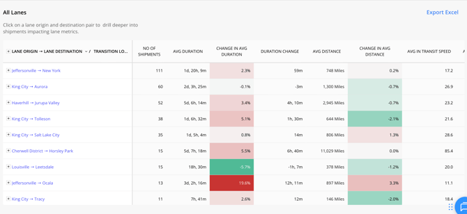
All Lanes:
See a complete view of lane metrics. Click any lane to navigate to Lane Details, or export the data for use in your own tools. Columns include Number of Shipments, Avg/Δ Duration, Distance, In-Transit Speed, Temperature & Alerts, Time Out of Range, Delay, Late Delivery Rate, and more.
2. Single Lane
When you want to dive deeper into a specific lane, switch from Lane Overview to Single Lane in the navigation bar. The Single Lane view highlights which shipments are most influencing performance, shows the routes taken, and compares results against the Tive Network to give you a broader context.
Tip: The page applies your global filters (including Advanced Settings). Use page-specific filters to narrow your focus by lanes, carriers, routes, or shipment stages.

Key Metric Cards:
This section highlights the key performance metrics for the lane you’re viewing and shows how they compare to a prior period. The “prior period” is set in your filters, so you can compare the selected date range against the previous period or the same time last year.

Duration Network Benchmarks:
Reveal helps you see how your lane duration stacks up against the Tive Network, so you know if your performance is best-in-class or lagging behind. Use this view to check whether long durations are an industry-wide challenge or specific to your shipments. With over 8M+ tracker journeys in our dataset and counting, benchmarks grow stronger and more reliable over time.
Note: Tive Network Benchmarks are currently only available for road shipments.

Route Level Analytics:
Reveal takes Lane Insights one level deeper by grouping all shipments with a lane into the most common routes. This helps you compare performance by route and identify where changes could reduce risk.
The map shows the most frequently used paths, while the table lists key metrics such as route distance and average travel time. By benchmarking against the wider Tive Network, you can quickly spot which routes are fastest and most consistent, helping you improve on-time performance and refine carrier SOPs.

Carriers to Investigate:
Reveal highlights which carriers are performing best and worst on each metric within a lane, so you can quickly see who deserves more volume and who may need corrective action.
To get the most out of this chart, toggle on the “overlay average” to compare each carrier’s results against your overall network average. Clicking a carrier name opens the Single Carrier dashboard filtered to that carrier and mode.
Tip: Adjust the minimum number of completed legs to ensure results compare carriers with enough volume for fair evaluation.

Key Shipments:
Once you’ve identified an issue or trend in carrier performance, the next step is pinpointing which shipments are driving it. This section highlights the individual shipments with the highest or lowest values for your selected metric, so you can quickly spot the outliers most likely influencing overall results. Click on the Shipment ID to jump directly into the full shipment view in the Tive platform for deeper analysis.
Metrics available: Duration, Delay, Temperature, Time Out of Range, or Sensor Alerts.

All Shipments Table:
Switch to the All Shipments tab to view detailed performance data for every shipment on the lane. Explore key metrics including Duration, Distance, Delay, Temperature stats, Time Out of Range, MKT (if applicable), Sensor Alerts, and Scheduled vs. Actual Arrival.
Click any Shipment ID to open the full shipment details in the platform, or export the data for further analysis in your own tools.

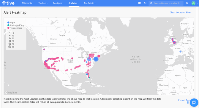
Alert Heatmap:
See where sensor alerts cluster geographically along the lane. The map highlights alert hotspots, while the table breaks down alert counts by location and type. This helps you pinpoint high-risk regions that drive the most issues.
Key Points to Know
- Easily identify high risk lanes: Leverage the key metric cards and top lanes bar chart to quickly spot lanes that are underperforming on critical metrics.
- Surface key shipments influencing metrics: Quickly drill into the shipments that might be causing surprising metric performance. Easily navigate to those shipment details in the platform to continue your investigation.
- Route & Lane Level Tive Benchmarks: See how your lane durations compare to other shipments from Tive’s network of 8M+ tracker journeys.
- Exports Available: Export tables for sharing or analysis in external tools.
- Data Coverage: Includes all completed shipments within the selected date range.
Best Practices
- Start Broad, Then Drill Down: Begin in Lanes Overview to spot risky or high-volume lanes, then investigate in Lane Details.
- Use Network Benchmarks: Compare your results to the Tive Network to understand if performance issues are unique to you or industry-wide.
- Layer Metrics Together: Look at duration, delay, temperature, and alerts side by side for a complete view of lane health.
- Filter for Relevance: Apply minimum shipment thresholds and stage filters to cut noise and focus on the shipments that matter most.
Need Help?
If you have additional questions, reach out to support@tive.com for assistance.
Appendix A: Detailed Metric Calculations
This appendix explains how Reveal calculates key performance metrics, so you know exactly what goes into the numbers you see.
Time Out of Temperature Range
Measures the total time a shipment was outside its safe temperature range during each phase of the journey.
- For first deviation, shipment was out of range for 30 minutes (3:00 to 3:30)
- For second deviation, shipment was out of range for 38 minutes (3:52 to 4:30)
|
Time |
Temp |
Alert Threshold |
Time out of Temp |
|
3:00 |
27.6 |
27 |
30 |
|
3:15 |
27.3 |
27 |
|
|
3:30 |
26.9 |
27 |
- |
|
3:45 |
26.5 |
27 |
|
|
3:52 |
27.2 |
27 |
38 |
|
4:00 |
27.3 |
27 |
|
|
4:15 |
27.4 |
27 |
|
|
4:30 |
26.5 |
27 |
|
|
Time out of Temp Range |
68 |
||
On-Time Performance
Includes both the Late Delivery Rate and the Average Delay. Shipments without a scheduled arrival time are excluded from these calculations.
- Late Delivery Rate: The percentage of shipments that arrive late. For example, if 2 of 4 shipments arrive late, the rate is 50%.
- Average Delay: Average delay time for late shipments. For example, if 2 shipments are late by 30 and 120 minutes, the average delay is 75 minutes ((30+120)/2).
|
Scheduled Arrival |
Actual Arrival |
Late? |
Minutes Late |
|
|
Shipment 1 |
n/a |
4:00 PM |
n/a |
n/a |
|
Shipment 2 |
3:00 PM |
2:00 PM |
No |
n/a |
|
Shipment 3 |
3:00 PM |
3:00 PM |
No |
n/a |
|
Shipment 4 |
3:00 PM |
3:30 PM |
Yes |
30 |
|
Shipment 5 |
3:00 PM |
5:00 PM |
Yes |
120 |
|
Late Delivery Rate % |
50.00% |
|||
|
Average Delay (minutes) |
75 |
|||
Alert Counts per Shipment Stage
Reveal calculates alert averages only for shipments that had the relevant alert type configured (for example, a temperature alert). The denominator for the average is the number of shipments with that alert preset, not the total number of shipments.
For example:
- Temperature alerts are averaged across shipments that had a temperature preset.
- If a shipment didn’t have a temperature preset attached, it’s excluded from the calculation.
The table below shows how averages are derived from temperature alerts, time out of temperature, and total alerts:
|
Temp Alert Preset? |
# of Temp Alerts |
Time out of Temp |
Any Alert preset |
Total Alerts |
|
|
Shipment 1 |
Y |
0 |
30 |
Y |
0 |
|
Shipment 2 |
Y |
1 |
20 |
Y |
1 |
|
Shipment 3 |
Y |
2 |
120 |
Y |
2 |
|
Shipment 4 |
Y |
0 |
0 |
Y |
5 |
|
Shipment 5 |
N |
Y |
0 |
||
|
Shipment 6 |
N |
N |
|||
|
Total (6 shipments) |
4 |
3 |
170 |
5 |
8 |
|
Average |
0.75 |
42.5 |
1.6 |
||
|
Calculation |
3 alerts / 4 shipments |
170 minutes / 4 shipments |
8 alerts / 5 shipments |